Content from Introduction to R and RStudio
Last updated on 2024-11-19 | Edit this page
Overview
Questions
- How to find your way around RStudio?
- How to interact with R?
- How to manage your environment?
- How to install packages?
Objectives
- Describe the purpose and use of each pane in the RStudio IDE
- Locate buttons and options in the RStudio IDE
- Define a variable
- Assign data to a variable
- Manage a workspace in an interactive R session
- Use mathematical and comparison operators
- Call functions
- Manage packages
Motivation
Science is a multi-step process: once you’ve designed an experiment and collected data, the real fun begins! This lesson will teach you how to start this process using R and RStudio. We will begin with raw data, perform exploratory analyses, and learn how to plot results graphically. This example starts with a dataset from gapminder.org containing population information for many countries through time. Can you read the data into R? Can you plot the population for Senegal? Can you calculate the average income for countries on the continent of Asia? By the end of these lessons you will be able to do things like plot the populations for all of these countries in under a minute!
Introduction to RStudio
Throughout this lesson, we’re going to teach you some of the fundamentals of the R language as well as some best practices for organizing code for scientific projects that will make your life easier.
We’ll be using RStudio: a free, open-source R Integrated Development Environment (IDE). It provides a built-in editor, works on all platforms (including on servers) and provides many advantages such as integration with version control and project management.
Basic layout
When you first open RStudio, you will be greeted by three panels:
- The interactive R console/Terminal (entire left)
- Environment/History/Connections (tabbed in upper right)
- Files/Plots/Packages/Help/Viewer (tabbed in lower right)
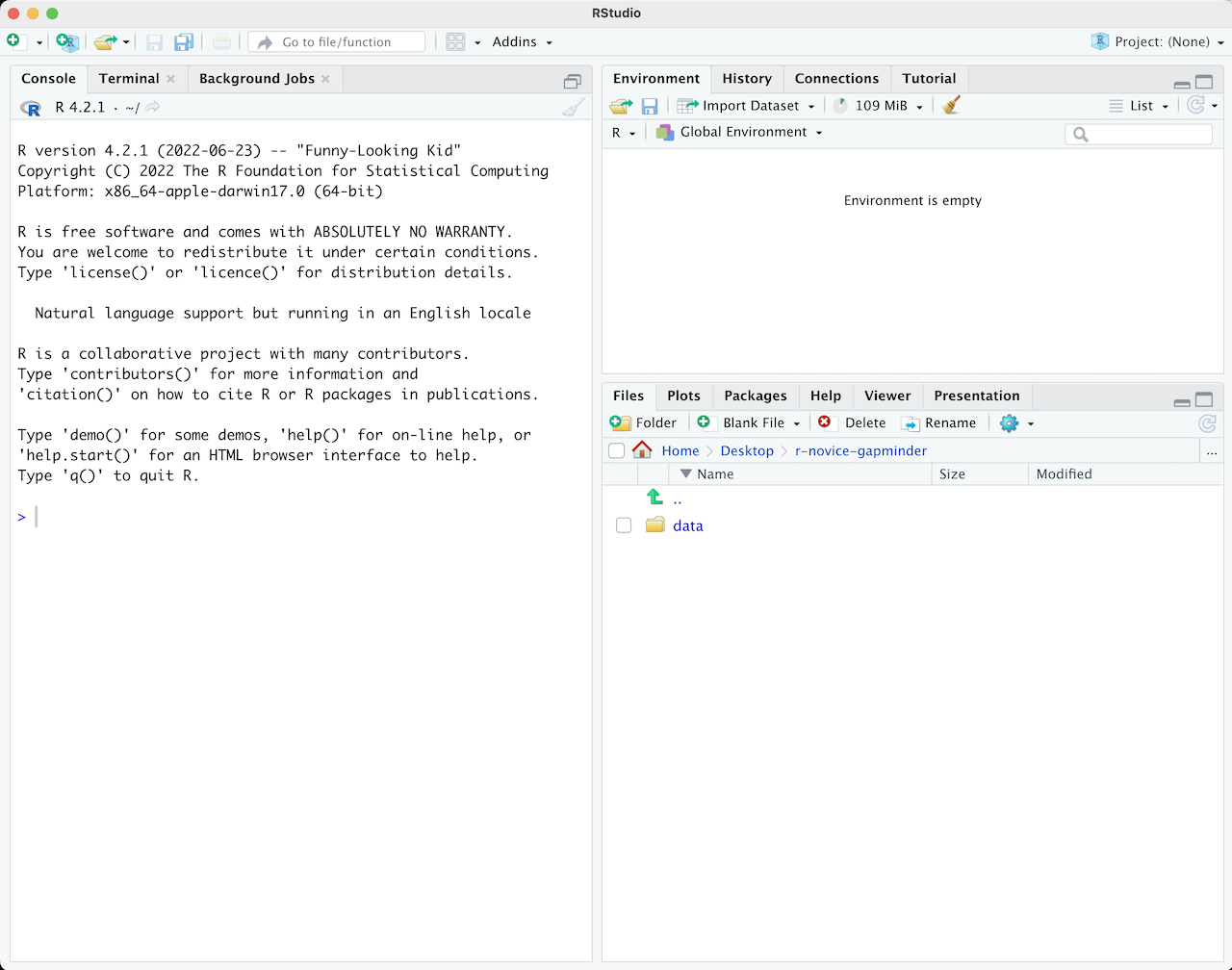
Once you open files, such as R scripts, an editor panel will also open in the top left.
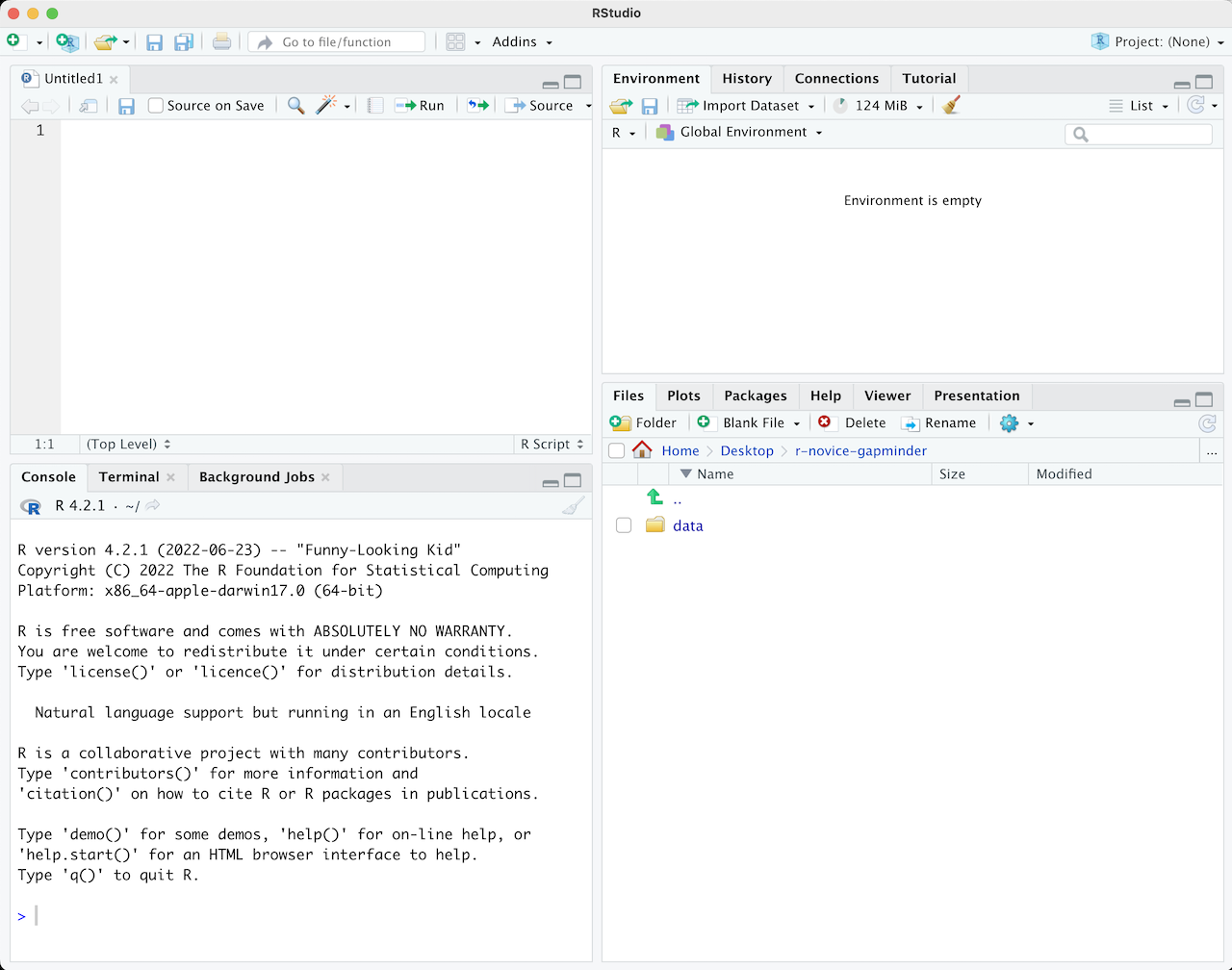
R scripts
Any commands that you write in the R console can be saved to a file
to be re-run again. Files containing R code to be ran in this way are
called R scripts. R scripts have .R at the end of their
names to let you know what they are.
Workflow within RStudio
There are two main ways one can work within RStudio:
- Test and play within the interactive R console then copy code into a .R file to run later.
- This works well when doing small tests and initially starting off.
- It quickly becomes laborious
- Start writing in a .R file and use RStudio’s short cut keys for the Run command to push the current line, selected lines or modified lines to the interactive R console.
- This is a great way to start; all your code is saved for later
- You will be able to run the file you create from within RStudio or
using R’s
source()function.
Tip: Running segments of your code
RStudio offers you great flexibility in running code from within the editor window. There are buttons, menu choices, and keyboard shortcuts. To run the current line, you can
- click on the
Runbutton above the editor panel, or - select “Run Lines” from the “Code” menu, or
- hit Ctrl+Return in Windows or Linux or
⌘+Return on OS X. (This shortcut can also be seen
by hovering the mouse over the button). To run a block of code, select
it and then
Run. If you have modified a line of code within a block of code you have just run, there is no need to reselect the section andRun, you can use the next button along,Re-run the previous region. This will run the previous code block including the modifications you have made.
Introduction to R
Much of your time in R will be spent in the R interactive console.
This is where you will run all of your code, and can be a useful
environment to try out ideas before adding them to an R script file.
This console in RStudio is the same as the one you would get if you
typed in R in your command-line environment.
The first thing you will see in the R interactive session is a bunch of information, followed by a “>” and a blinking cursor. In many ways this is similar to the shell environment you learned about during the shell lessons: it operates on the same idea of a “Read, evaluate, print loop”: you type in commands, R tries to execute them, and then returns a result.
Using R as a calculator
The simplest thing you could do with R is to do arithmetic:
R
1 + 100
OUTPUT
[1] 101And R will print out the answer, with a preceding “[1]”. [1] is the index of the first element of the line being printed in the console. For more information on indexing vectors, see Episode 6: Subsetting Data.
If you type in an incomplete command, R will wait for you to complete
it. If you are familiar with Unix Shell’s bash, you may recognize
this
behavior from bash.
OUTPUT
+Any time you hit return and the R session shows a “+” instead of a “>”, it means it’s waiting for you to complete the command. If you want to cancel a command you can hit Esc and RStudio will give you back the “>” prompt.
Tip: Canceling commands
If you’re using R from the command line instead of from within RStudio, you need to use Ctrl+C instead of Esc to cancel the command. This applies to Mac users as well!
Canceling a command isn’t only useful for killing incomplete commands: you can also use it to tell R to stop running code (for example if it’s taking much longer than you expect), or to get rid of the code you’re currently writing.
When using R as a calculator, the order of operations is the same as you would have learned back in school.
From highest to lowest precedence:
- Parentheses:
(,) - Exponents:
^or** - Multiply:
* - Divide:
/ - Add:
+ - Subtract:
-
R
3 + 5 * 2
OUTPUT
[1] 13Use parentheses to group operations in order to force the order of evaluation if it differs from the default, or to make clear what you intend.
R
(3 + 5) * 2
OUTPUT
[1] 16This can get unwieldy when not needed, but clarifies your intentions. Remember that others may later read your code.
R
(3 + (5 * (2 ^ 2))) # hard to read
3 + 5 * 2 ^ 2       # clear, if you remember the rules
3 + 5 * (2 ^ 2)     # if you forget some rules, this might help
The text after each line of code is called a “comment”. Anything that
follows after the hash (or octothorpe) symbol # is ignored
by R when it executes code.
Really small or large numbers get a scientific notation:
R
2/10000
OUTPUT
[1] 2e-04Which is shorthand for “multiplied by 10^XX”. So
2e-4 is shorthand for 2 * 10^(-4).
You can write numbers in scientific notation too:
R
5e3 # Note the lack of minus here
OUTPUT
[1] 5000Mathematical functions
R has many built in mathematical functions. To call a function, we can type its name, followed by open and closing parentheses. Functions take arguments as inputs, anything we type inside the parentheses of a function is considered an argument. Depending on the function, the number of arguments can vary from none to multiple. For example:
R
getwd() #returns an absolute filepath
doesn’t require an argument, whereas for the next set of mathematical functions we will need to supply the function a value in order to compute the result.
R
sin(1) # trigonometry functions
OUTPUT
[1] 0.841471R
log(1) # natural logarithm
OUTPUT
[1] 0R
log10(10) # base-10 logarithm
OUTPUT
[1] 1R
exp(0.5) # e^(1/2)
OUTPUT
[1] 1.648721Don’t worry about trying to remember every function in R. You can look them up on Google, or if you can remember the start of the function’s name, use the tab completion in RStudio.
This is one advantage that RStudio has over R on its own, it has auto-completion abilities that allow you to more easily look up functions, their arguments, and the values that they take.
Typing a ? before the name of a command will open the
help page for that command. When using RStudio, this will open the
‘Help’ pane; if using R in the terminal, the help page will open in your
browser. The help page will include a detailed description of the
command and how it works. Scrolling to the bottom of the help page will
usually show a collection of code examples which illustrate command
usage. We’ll go through an example later.
Comparing things
We can also do comparisons in R:
R
1 == 1 # equality (note two equals signs, read as "is equal to")
OUTPUT
[1] TRUER
1 != 2 # inequality (read as "is not equal to")
OUTPUT
[1] TRUER
1 < 2 # less than
OUTPUT
[1] TRUER
1 <= 1 # less than or equal to
OUTPUT
[1] TRUER
1 > 0 # greater than
OUTPUT
[1] TRUER
1 >= -9 # greater than or equal to
OUTPUT
[1] TRUETip: Comparing Numbers
A word of warning about comparing numbers: you should never use
== to compare two numbers unless they are integers (a data
type which can specifically represent only whole numbers).
Computers may only represent decimal numbers with a certain degree of precision, so two numbers which look the same when printed out by R, may actually have different underlying representations and therefore be different by a small margin of error (called Machine numeric tolerance).
Instead you should use the all.equal function.
Further reading: http://floating-point-gui.de/
Variables and assignment
We can store values in variables using the assignment operator
<-, like this:
R
x <- 1/40
Notice that assignment does not print a value. Instead, we stored it
for later in something called a variable.
x now contains the value
0.025:
R
x
OUTPUT
[1] 0.025More precisely, the stored value is a decimal approximation of this fraction called a floating point number.
Look for the Environment tab in the top right panel of
RStudio, and you will see that x and its value have
appeared. Our variable x can be used in place of a number
in any calculation that expects a number:
R
log(x)
OUTPUT
[1] -3.688879Notice also that variables can be reassigned:
R
x <- 100
x used to contain the value 0.025 and now it has the
value 100.
Assignment values can contain the variable being assigned to:
R
x <- x + 1 #notice how RStudio updates its description of x on the top right tab
y <- x * 2
The right hand side of the assignment can be any valid R expression. The right hand side is fully evaluated before the assignment occurs.
Variable names can contain letters, numbers, underscores and periods but no spaces. They must start with a letter or a period followed by a letter (they cannot start with a number nor an underscore). Variables beginning with a period are hidden variables. Different people use different conventions for long variable names, these include
- periods.between.words
- underscores_between_words
- camelCaseToSeparateWords
What you use is up to you, but be consistent.
It is also possible to use the = operator for
assignment:
R
x = 1/40
But this is much less common among R users. The most important thing
is to be consistent with the operator you use. There
are occasionally places where it is less confusing to use
<- than =, and it is the most common symbol
used in the community. So the recommendation is to use
<-.
Vectorization
One final thing to be aware of is that R is vectorized, meaning that variables and functions can have vectors as values. In contrast to physics and mathematics, a vector in R describes a set of values in a certain order of the same data type. For example
R
1:5
OUTPUT
[1] 1 2 3 4 5R
2^(1:5)
OUTPUT
[1] 2 4 8 16 32R
x <- 1:5
2^x
OUTPUT
[1] 2 4 8 16 32To create vectors, you can use the combine command:
R
my_vec <- c(1, 3, 5)
2^my_vec
OUTPUT
[1] 2 8 32Managing your environment
There are a few useful commands you can use to interact with the R session.
ls will list all of the variables and functions stored
in the global environment (your working R session):
R
ls()
OUTPUT
[1] "x" "y"Note here that we didn’t give any arguments to ls, but
we still needed to give the parentheses to tell R to call the
function.
If we type ls by itself, R prints a bunch of code
instead of a listing of objects.
R
ls
OUTPUT
function (name, pos = -1L, envir = as.environment(pos), all.names = FALSE,
    pattern, sorted = TRUE)
{
    if (!missing(name)) {
        pos <- tryCatch(name, error = function(e) e)
        if (inherits(pos, "error")) {
            name <- substitute(name)
            if (!is.character(name))
                name <- deparse(name)
            warning(gettextf("%s converted to character string",
                sQuote(name)), domain = NA)
            pos <- name
        }
    }
    all.names <- .Internal(ls(envir, all.names, sorted))
    if (!missing(pattern)) {
        if ((ll <- length(grep("[", pattern, fixed = TRUE))) &&
            ll != length(grep("]", pattern, fixed = TRUE))) {
            if (pattern == "[") {
                pattern <- "\\["
                warning("replaced regular expression pattern '[' by  '\\\\['")
            }
            else if (length(grep("[^\\\\]\\[<-", pattern))) {
                pattern <- sub("\\[<-", "\\\\\\[<-", pattern)
                warning("replaced '[<-' by '\\\\[<-' in regular expression pattern")
            }
        }
        grep(pattern, all.names, value = TRUE)
    }
    else all.names
}
<bytecode: 0x5613a48f2d60>
<environment: namespace:base>
What’s going on here?
Like everything in R, ls is the name of an object, and
entering the name of an object by itself prints the contents of the
object. The object x that we created earlier contains 1, 2,
3, 4, 5:
R
x
OUTPUT
[1] 1 2 3 4 5The object ls contains the R code that makes the
ls function work! We’ll talk more about how functions work
and start writing our own later.
You can use rm to delete objects you no longer need:
R
rm(x)
If you have lots of things in your environment and want to delete all
of them, you can pass the results of ls to the
rm function:
R
rm(list = ls())
In this case we’ve combined the two. Like the order of operations, anything inside the innermost parentheses is evaluated first, and so on.
In this case we’ve specified that the results of ls
should be used for the list argument in rm.
When assigning values to arguments by name, you must use the
= operator!!
If instead we use <-, there will be unintended side
effects, or you may get an error message:
R
rm(list <- ls())
ERROR
Error in rm(list <- ls()): ... must contain names or character stringsTip: Warnings vs. Errors
Pay attention when R does something unexpected! Errors, like above, are thrown when R cannot proceed with a calculation. Warnings on the other hand usually mean that the function has run, but it probably hasn’t worked as expected.
In both cases, the message that R prints out usually give you clues how to fix a problem.
R Packages
It is possible to add functions to R by writing a package, or by obtaining a package written by someone else. As of this writing, there are over 10,000 packages available on CRAN (the comprehensive R archive network). R and RStudio have functionality for managing packages:
- You can see what packages are installed by typing
installed.packages() - You can install packages by typing
install.packages("packagename"), wherepackagenameis the package name, in quotes. - You can update installed packages by typing
update.packages() - You can remove a package with
remove.packages("packagename") - You can make a package available for use with
library(packagename)
Packages can also be viewed, loaded, and detached in the Packages tab of the lower right panel in RStudio. Clicking on this tab will display all of the installed packages with a checkbox next to them. If the box next to a package name is checked, the package is loaded and if it is empty, the package is not loaded. Click an empty box to load that package and click a checked box to detach that package.
Packages can be installed and updated from the Package tab with the Install and Update buttons at the top of the tab.
Challenge 2
What will be the value of each variable after each statement in the following program?
R
mass <- 47.5
age <- 122
mass <- mass * 2.3
age <- age - 20
R
mass <- 47.5
This will give a value of 47.5 for the variable mass
R
age <- 122
This will give a value of 122 for the variable age
R
mass <- mass * 2.3
This will multiply the existing value of 47.5 by 2.3 to give a new value of 109.25 to the variable mass.
R
age <- age - 20
This will subtract 20 from the existing value of 122 to give a new value of 102 to the variable age.
Challenge 3
Run the code from the previous challenge, and write a command to compare mass to age. Is mass larger than age?
One way of answering this question in R is to use the
> to set up the following:
R
mass > age
OUTPUT
[1] TRUEThis should yield a boolean value of TRUE since 109.25 is greater than 102.
Challenge 4
Clean up your working environment by deleting the mass and age variables.
We can use the rm command to accomplish this task
R
rm(age, mass)
Challenge 5
Install the following packages: ggplot2,
gapminder
We can use the install.packages() command to install the
required packages.
R
install.packages("ggplot2")
install.packages("gapminder")
An alternate solution, to install multiple packages with a single
install.packages() command is:
R
install.packages(c("ggplot2", "gapminder"))
Key Points
- Use RStudio to write and run R programs.
- R has the usual arithmetic operators and mathematical functions.
- Use
<-to assign values to variables. - Use
ls()to list the variables in a program. - Use
rm()to delete objects in a program. - Use
install.packages()to install packages (libraries).
Content from Exploring Data Frames
Last updated on 2024-11-19 | Edit this page
Overview
Questions
- How can I manipulate a data frame?
Objectives
- Display basic properties of data frames including size and class of the columns, names, and first few rows.
- Subset data frames by index and name.
Working with data
Let’s work with a realistic dataset in data frame. First, we need to set up our environment:
R
dir.create("~/R_tutorial/data", recursive = TRUE)
setwd("~/R_tutorial")
This makes sure that everything we do from now on happens relative to
the ~/R_tutorial directory. In practice, for better
reproducibility, you’ll want to set up an R project.
Now let’s download the data:
R
download.file("https://swcarpentry.github.io/r-novice-gapminder/data/gapminder_data.csv",
              destfile = "data/gapminder_data.csv")
And finally, we can read it into a variable
R
gapminder <- read.csv("data/gapminder_data.csv")
Miscellaneous Tips
Another type of file you might encounter are tab-separated value files (.tsv). To specify a tab as a separator, use
"\\t"orread.delim().You can also read in files directly into R from the Internet by replacing the file paths with a web address in
read.csv. One should note that in doing this no local copy of the csv file is first saved onto your computer. For example,
R
gapminder <- read.csv("https://raw.githubusercontent.com/swcarpentry/r-novice-gapminder/gh-pages/_episodes_rmd/data/gapminder_data.csv")
- You can read directly from excel spreadsheets without converting them to plain text first by using the readxl package.
Let’s investigate gapminder a bit; the first thing we should always
do is check out what the data looks like with str:
R
str(gapminder)
OUTPUT
'data.frame':	1704 obs. of  6 variables:
 $ country  : chr  "Afghanistan" "Afghanistan" "Afghanistan" "Afghanistan" ...
 $ year     : int  1952 1957 1962 1967 1972 1977 1982 1987 1992 1997 ...
 $ pop      : num  8425333 9240934 10267083 11537966 13079460 ...
 $ continent: chr  "Asia" "Asia" "Asia" "Asia" ...
 $ lifeExp  : num  28.8 30.3 32 34 36.1 ...
 $ gdpPercap: num  779 821 853 836 740 ...
An additional method for examining the structure of gapminder is to
use the summary function. This function can be used on
various objects in R. For data frames, summary yields a
numeric, tabular, or descriptive summary of each column. Numeric or
integer columns are described by the descriptive statistics (quartiles
and mean), and character columns by its length, class, and mode.
R
summary(gapminder)
OUTPUT
   country               year           pop             continent
 Length:1704        Min.   :1952   Min.   :6.001e+04   Length:1704
 Class :character   1st Qu.:1966   1st Qu.:2.794e+06   Class :character
 Mode  :character   Median :1980   Median :7.024e+06   Mode  :character
                    Mean   :1980   Mean   :2.960e+07
                    3rd Qu.:1993   3rd Qu.:1.959e+07
                    Max.   :2007   Max.   :1.319e+09
    lifeExp        gdpPercap
 Min.   :23.60   Min.   :   241.2
 1st Qu.:48.20   1st Qu.:  1202.1
 Median :60.71   Median :  3531.8
 Mean   :59.47   Mean   :  7215.3
 3rd Qu.:70.85   3rd Qu.:  9325.5
 Max.   :82.60   Max.   :113523.1
To extract a column, we can use the $ operator. We use
head to just see the first few entries:
R
head(gapminder$lifeExp)
OUTPUT
[1] 28.801 30.332 31.997 34.020 36.088 38.438We can examine the types of individual columns of the data frame with
the typeof function:
R
typeof(gapminder$year)
OUTPUT
[1] "integer"R
typeof(gapminder$country)
OUTPUT
[1] "character"R
str(gapminder$country)
OUTPUT
chr [1:1704] "Afghanistan" "Afghanistan" "Afghanistan" "Afghanistan" ...No matter how complicated data gets, in R, it is always one of 5 main
types: double, integer, complex,
logical, and character.
We can also interrogate the data frame for information about its
dimensions; remembering that str(gapminder) said there were
1704 observations of 6 variables in gapminder, what do you think the
following will produce, and why?
R
length(gapminder)
OUTPUT
[1] 6A fair guess would have been to say that the length of a data frame would be the number of rows it has (1704), but this is not the case. Data frames are stored as lists of vectors, so the length is the number of separate columns of data.
Lists vs vectors
What’s the difference between a list and a vector in R? A vector is a collection of objects of the same type:
R
chr_vec <- c('a', 'b', 'c')
int_vec <- c(1, 2, 3)
A list on the other hand can contain multiple types:
R
ex_list <- list(1, "a", TRUE, 1+4i)
A data frame is nothing more than a fancy list!
R
typeof(gapminder)
OUTPUT
[1] "list"When length gave us 6, it’s because gapminder is built
out of a list of 6 columns. To get the number of rows and columns in our
dataset, try:
R
nrow(gapminder)
OUTPUT
[1] 1704R
ncol(gapminder)
OUTPUT
[1] 6Or, both at once:
R
dim(gapminder)
OUTPUT
[1] 1704 6We’ll also likely want to know what the titles of all the columns are, so we can ask for them later:
R
colnames(gapminder)
OUTPUT
[1] "country" "year" "pop" "continent" "lifeExp" "gdpPercap"At this stage, it’s important to ask ourselves if the structure R is reporting matches our intuition or expectations; do the basic data types reported for each column make sense? If not, we need to sort any problems out now before they turn into bad surprises down the road, using what we’ve learned about how R interprets data, and the importance of strict consistency in how we record our data.
Once we’re happy that the data types and structures seem reasonable, it’s time to start digging into our data proper. Check out the first few lines:
R
head(gapminder)
OUTPUT
      country year      pop continent lifeExp gdpPercap
1 Afghanistan 1952  8425333      Asia  28.801  779.4453
2 Afghanistan 1957  9240934      Asia  30.332  820.8530
3 Afghanistan 1962 10267083      Asia  31.997  853.1007
4 Afghanistan 1967 11537966      Asia  34.020  836.1971
5 Afghanistan 1972 13079460      Asia  36.088  739.9811
6 Afghanistan 1977 14880372      Asia  38.438  786.1134
Challenge 1
It’s good practice to also check the last few lines of your data and some in the middle. How would you do this?
Hint: You can get help on a command by typing ?
before the command name in the console, e.g., ?head.
Searching for lines specifically in the middle isn’t too hard, but we could ask for a few lines at random. If you have time after finishing the other challenges, think of a way to code this.
Hint: You can search for commands by typing ??
before a search term, e.g., ??random.
To check the last few lines it’s relatively simple as R already has a function for this:
R
tail(gapminder)
tail(gapminder, n = 15)
What about a few arbitrary rows just in case something is odd in the middle?
Tip: There are several ways to achieve this.
The solution here presents one form of using nested functions, i.e. a function passed as an argument to another function. This might sound like a new concept, but you are already using it! Remember my_dataframe[rows, cols] will print to screen your data frame with the number of rows and columns you asked for (although you might have asked for a range or named columns for example). How would you get the last row if you don’t know how many rows your data frame has? R has a function for this. What about getting a (pseudorandom) sample? R also has a function for this.
R
gapminder[sample(nrow(gapminder), 5), ]
To make sure our analysis is reproducible, we should put the code into a script file so we can come back to it later.
Challenge 2
Make a scripts/ directory inside your working directory.
Go to File -> New File -> R Script, and write an R script to load
in the gapminder dataset. Save the script in your scripts/
directory.
Run the script using the source function, using the file
path as its argument (or by pressing the “source” button in
RStudio).
The source function can be used to use a script within a
script. Assume you would like to load the same type of file over and
over again and therefore you need to specify the arguments to fit the
needs of your file. Instead of writing the necessary argument again and
again you could just write it once and save it as a script. Then, you
can use source("Your_Script_containing_the_load_function")
in a new script to use the function of that script without writing
everything again. Check out ?source to find out more.
R
download.file("https://raw.githubusercontent.com/swcarpentry/r-novice-gapminder/gh-pages/_episodes_rmd/data/gapminder_data.csv", destfile = "data/gapminder_data.csv")
gapminder <- read.csv(file = "data/gapminder_data.csv")
To run the script and load the data into the gapminder
variable:
R
source(file = "scripts/load-gapminder.R")
Challenge 3
Read the output of str(gapminder) again; this time, use
what you’ve learned about lists and vectors, as well as the output of
functions like colnames and dim to explain
what everything that str prints out for gapminder means. If
there are any parts you can’t interpret, discuss with your
neighbors!
The object gapminder is a data frame with columns
-
countryandcontinentare character strings. -
yearis an integer vector. -
pop,lifeExp, andgdpPercapare numeric vectors.
Subsetting data frames
Generally, use the [] operator to subset data. Starting
with a small vector, we can get the first entry.
R
x <- c("a", "b", "c")
x[1]
OUTPUT
[1] "a"Vector numbering in R starts at 1
In many programming languages (C and Python, for example), the first element of a vector has an index of 0. In R, the first element is 1.
Since a data frame is just a list of its columns, using
[ to index will work the same way as a list. It turns out
that the resulting object will also be a data frame:
R
head(gapminder[3])
OUTPUT
       pop
1  8425333
2  9240934
3 10267083
4 11537966
5 13079460
6 14880372
On the other hand, [[ will extract a single
column as a vector:
R
head(gapminder[["lifeExp"]])
OUTPUT
[1] 28.801 30.332 31.997 34.020 36.088 38.438And as we’ve seen, $ provides a convenient shorthand to
extract columns by name:
R
head(gapminder$year)
OUTPUT
[1] 1952 1957 1962 1967 1972 1977With two arguments, [ can index rows and columns:
R
gapminder[1:3,]
OUTPUT
      country year      pop continent lifeExp gdpPercap
1 Afghanistan 1952  8425333      Asia  28.801  779.4453
2 Afghanistan 1957  9240934      Asia  30.332  820.8530
3 Afghanistan 1962 10267083      Asia  31.997  853.1007
If we subset a single row, the result will be a data frame (because the elements are mixed types):
R
gapminder[3,]
OUTPUT
      country year      pop continent lifeExp gdpPercap
3 Afghanistan 1962 10267083      Asia  31.997  853.1007
But for a single column the result will be a vector (this can be
changed with the third argument, drop = FALSE).
Challenge 4
Fix each of the following common data frame subsetting errors:
- Extract observations collected for the year 1957
- Extract all columns except 1 through to 4
R
gapminder[,-1:4]
- Extract the rows where the life expectancy is longer the 80 years
R
gapminder[gapminder$lifeExp > 80]
- Extract the first row, and the fourth and fifth columns
(
continentandlifeExp).
R
gapminder[1, 4, 5]
- Advanced: extract rows that contain information for the years 2002 and 2007
R
gapminder[gapminder$year == 2002 | 2007,]
Fix each of the following common data frame subsetting errors:
- Extract observations collected for the year 1957
R
# gapminder[gapminder$year = 1957,]
gapminder[gapminder$year == 1957,]
- Extract all columns except 1 through to 4
R
# gapminder[,-1:4]
gapminder[,-c(1:4)]
- Extract the rows where the life expectancy is longer than 80 years
R
# gapminder[gapminder$lifeExp > 80]
gapminder[gapminder$lifeExp > 80,]
- Extract the first row, and the fourth and fifth columns
(
continentandlifeExp).
R
# gapminder[1, 4, 5]
gapminder[1, c(4, 5)]
- Advanced: extract rows that contain information for the years 2002 and 2007
R
# gapminder[gapminder$year == 2002 | 2007,]
gapminder[gapminder$year == 2002 | gapminder$year == 2007,]
gapminder[gapminder$year %in% c(2002, 2007),]
Challenge 5
Why does
gapminder[1:20]return an error? How does it differ fromgapminder[1:20, ]?Create a new
data.framecalledgapminder_smallthat only contains rows 1 through 9 and 19 through 23. You can do this in one or two steps.
gapminderis a data.frame so needs to be subsetted on two dimensions.gapminder[1:20, ]subsets the data to give the first 20 rows and all columns.
R
gapminder_small <- gapminder[c(1:9, 19:23),]
Key Points
- Use
str(),summary(),nrow(),ncol(),dim(),colnames(),rownames(),head(), andtypeof()to understand the structure of a data frame. - Read in a csv file using
read.csv(). - Understand what
length()of a data frame represents. - Indexing in R starts at 1, not 0.
- Access individual values by location using
[].
Content from Creating Publication-Quality Graphics with ggplot2
Last updated on 2024-11-19 | Edit this page
Overview
Questions
- How can I create publication-quality graphics in R?
Objectives
- To be able to use ggplot2 to generate publication-quality graphics.
- To apply geometry, aesthetic, and statistics layers to a ggplot plot.
- To manipulate the aesthetics of a plot using different colors, shapes, and lines.
- To improve data visualization through transforming scales and paneling by group.
- To save a plot created with ggplot to disk.
Plotting our data is one of the best ways to quickly explore it and the various relationships between variables.
There are three main plotting systems in R, the base plotting system, the lattice package, and the ggplot2 package.
Today we’ll be learning about the ggplot2 package, because it is the most effective for creating publication-quality graphics.
ggplot2 is built on the grammar of graphics, the idea that any plot can be built from the same set of components: a data set, mapping aesthetics, and graphical layers:
Data sets are the data that you, the user, provide.
Mapping aesthetics are what connect the data to the graphics. They tell ggplot2 how to use your data to affect how the graph looks, such as changing what is plotted on the X or Y axis, or the size or color of different data points.
Layers are the actual graphical output from ggplot2. Layers determine what kinds of plot are shown (scatterplot, histogram, etc.), the coordinate system used (rectangular, polar, others), and other important aspects of the plot. The idea of layers of graphics may be familiar to you if you have used image editing programs like Photoshop, Illustrator, or Inkscape.
Let’s start off building an example using the gapminder data from
earlier. The most basic function is ggplot, which lets R
know that we’re creating a new plot. Any of the arguments we give the
ggplot function are the global options for the
plot: they apply to all layers on the plot.
R
library("ggplot2")
ggplot(data = gapminder)

Here we called ggplot and told it what data we want to
show on our figure. This is not enough information for
ggplot to actually draw anything. It only creates a blank
slate for other elements to be added to.
Now we’re going to add in the mapping aesthetics
using the aes function. aes tells
ggplot how variables in the data map to
aesthetic properties of the figure, such as which columns of
the data should be used for the x and
y locations.
R
ggplot(data = gapminder, mapping = aes(x = gdpPercap, y = lifeExp))
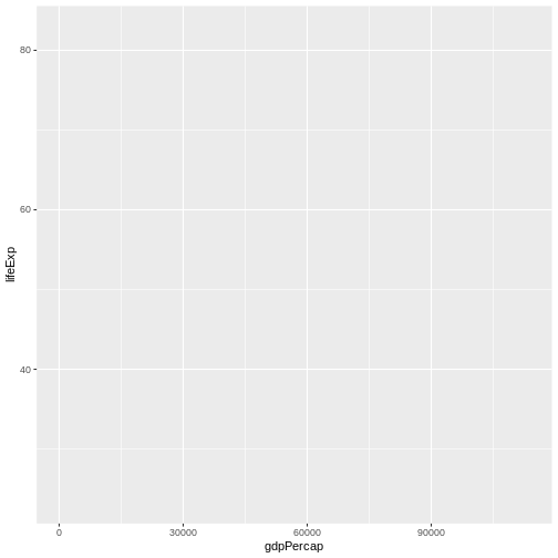
Here we told ggplot we want to plot the “gdpPercap”
column of the gapminder data frame on the x-axis, and the “lifeExp”
column on the y-axis. Notice that we didn’t need to explicitly pass
aes these columns
(e.g. x = gapminder[, "gdpPercap"]), this is because
ggplot is smart enough to know to look in the
data for that column!
The final part of making our plot is to tell ggplot how
we want to visually represent the data. We do this by adding a new
layer to the plot using one of the
geom functions.
R
ggplot(data = gapminder, mapping = aes(x = gdpPercap, y = lifeExp)) +
  geom_point()
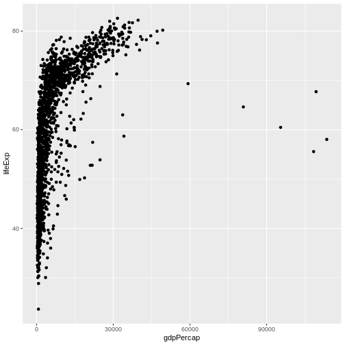
Here we used geom_point, which tells ggplot
we want to visually represent the relationship between
x and y as a scatterplot of
points.
Challenge 1
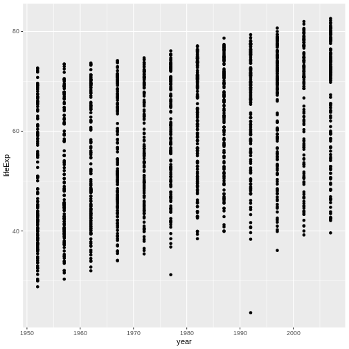
Modify the example so that the figure shows how life expectancy has changed over time:
R
ggplot(data = gapminder, mapping = aes(x = gdpPercap, y = lifeExp)) + geom_point()
Hint: the gapminder dataset has a column called “year”, which should appear on the x-axis.
Here is one possible solution:
R
ggplot(data = gapminder, mapping = aes(x = year, y = lifeExp)) + geom_point()
Challenge 2
In the previous examples and challenge we’ve used the
aes function to tell the scatterplot geom
about the x and y locations of each
point. Another aesthetic property we can modify is the point
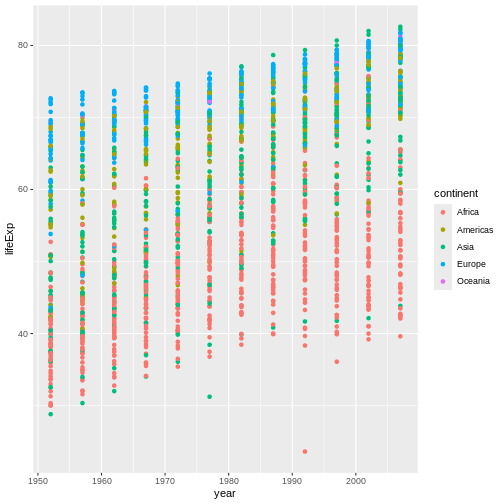
color. Modify the code from the previous challenge to
color the points by the “continent” column. What trends
do you see in the data? Are they what you expected?
The solution presented below adds color=continent to the
call of the aes function. The general trend seems to
indicate an increased life expectancy over the years. On continents with
stronger economies we find a longer life expectancy.
R
ggplot(data = gapminder, mapping = aes(x = year, y = lifeExp, color=continent)) +
  geom_point()
Layers
Using a scatterplot probably isn’t the best for visualizing change
over time. Instead, let’s tell ggplot to visualize the data
as a line plot:
R
ggplot(data = gapminder, mapping = aes(x=year, y=lifeExp, color=continent)) +
  geom_line()
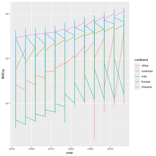
Instead of adding a geom_point layer, we’ve added a
geom_line layer.
However, the result doesn’t look quite as we might have expected: it seems to be jumping around a lot in each continent. Let’s try to separate the data by country, plotting one line for each country:
R
ggplot(data = gapminder, mapping = aes(x=year, y=lifeExp, group=country, color=continent)) +
  geom_line()
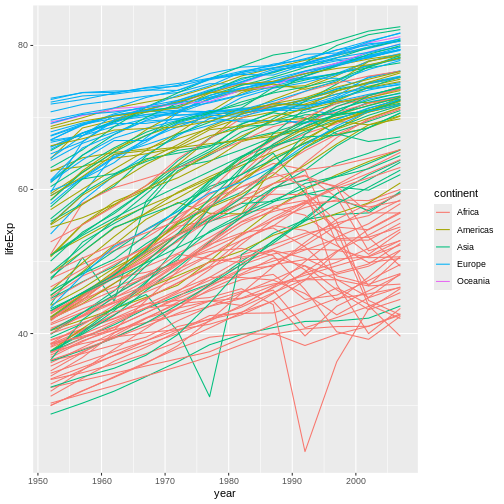
We’ve added the group aesthetic, which
tells ggplot to draw a line for each country.
But what if we want to visualize both lines and points on the plot? We can add another layer to the plot:
R
ggplot(data = gapminder, mapping = aes(x=year, y=lifeExp, group=country, color=continent)) +
  geom_line() + geom_point()

It’s important to note that each layer is drawn on top of the previous layer. In this example, the points have been drawn on top of the lines. Here’s a demonstration:
R
ggplot(data = gapminder, mapping = aes(x=year, y=lifeExp, group=country)) +
  geom_line(mapping = aes(color=continent)) + geom_point()

In this example, the aesthetic mapping of
color has been moved from the global plot options in
ggplot to the geom_line layer so it no longer
applies to the points. Now we can clearly see that the points are drawn
on top of the lines.
Tip: Setting an aesthetic to a value instead of a mapping
So far, we’ve seen how to use an aesthetic (such as
color) as a mapping to a variable in the data.
For example, when we use
geom_line(mapping = aes(color=continent)), ggplot will give
a different color to each continent. But what if we want to change the
color of all lines to blue? You may think that
geom_line(mapping = aes(color="blue")) should work, but it
doesn’t. Since we don’t want to create a mapping to a specific variable,
we can move the color specification outside of the aes()
function, like this: geom_line(color="blue").
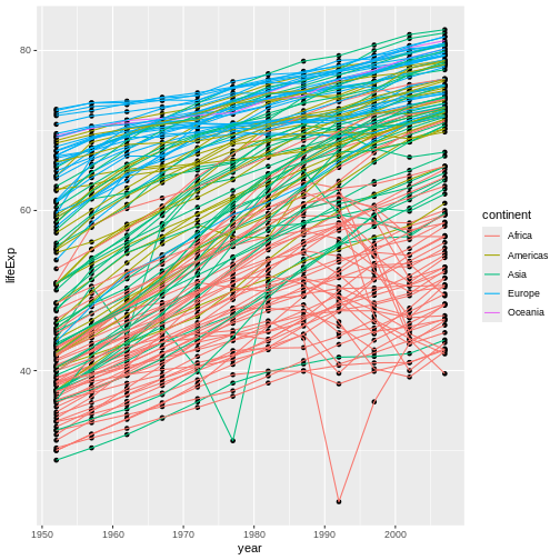
Challenge 3
Switch the order of the point and line layers from the previous example. What happened?
The lines now get drawn over the points!
R
ggplot(data = gapminder, mapping = aes(x=year, y=lifeExp, group=country)) +
 geom_point() + geom_line(mapping = aes(color=continent))
Transformations and statistics
ggplot2 also makes it easy to overlay statistical models over the data. To demonstrate we’ll go back to our first example:
R
ggplot(data = gapminder, mapping = aes(x = gdpPercap, y = lifeExp)) +
  geom_point()

Currently it’s hard to see the relationship between the points due to some strong outliers in GDP per capita. We can change the scale of units on the x axis using the scale functions. These control the mapping between the data values and visual values of an aesthetic. We can also modify the transparency of the points, using the alpha function, which is especially helpful when you have a large amount of data which is very clustered.
R
ggplot(data = gapminder, mapping = aes(x = gdpPercap, y = lifeExp)) +
  geom_point(alpha = 0.5) + scale_x_log10()
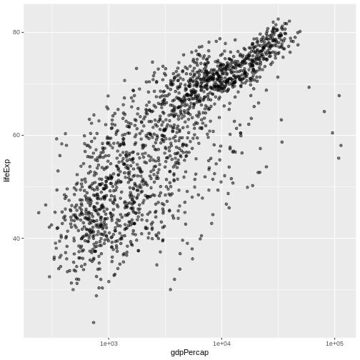
The scale_x_log10 function applied a transformation to
the coordinate system of the plot, so that each multiple of 10 is evenly
spaced from left to right. For example, a GDP per capita of 1,000 is the
same horizontal distance away from a value of 10,000 as the 10,000 value
is from 100,000. This helps to visualize the spread of the data along
the x-axis.
Tip Reminder: Setting an aesthetic to a value instead of a mapping
Notice that we used geom_point(alpha = 0.5). As the
previous tip mentioned, using a setting outside of the
aes() function will cause this value to be used for all
points, which is what we want in this case. But just like any other
aesthetic setting, alpha can also be mapped to a variable in
the data. For example, we can give a different transparency to each
continent with
geom_point(mapping = aes(alpha = continent)).
We can fit a simple relationship to the data by adding another layer,
geom_smooth:
R
ggplot(data = gapminder, mapping = aes(x = gdpPercap, y = lifeExp)) +
  geom_point(alpha = 0.5) + scale_x_log10() + geom_smooth(method="lm")
OUTPUT
`geom_smooth()` using formula = 'y ~ x'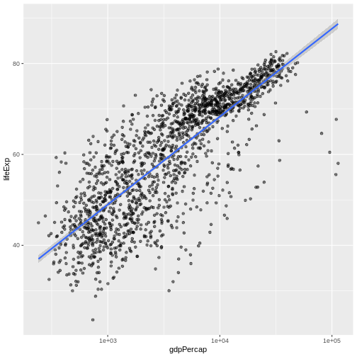
We can make the line thicker by setting the
size aesthetic in the geom_smooth
layer:
R
ggplot(data = gapminder, mapping = aes(x = gdpPercap, y = lifeExp)) +
  geom_point(alpha = 0.5) + scale_x_log10() + geom_smooth(method="lm", size=1.5)
WARNING
Warning: Using `size` aesthetic for lines was deprecated in ggplot2 3.4.0.
ℹ Please use `linewidth` instead.
This warning is displayed once every 8 hours.
Call `lifecycle::last_lifecycle_warnings()` to see where this warning was
generated.
OUTPUT
`geom_smooth()` using formula = 'y ~ x'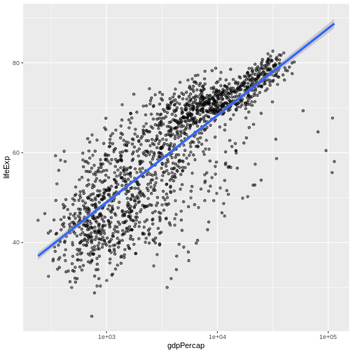
There are two ways an aesthetic can be specified. Here we
set the size aesthetic by passing it as an
argument to geom_smooth. Previously in the lesson we’ve
used the aes function to define a mapping between
data variables and their visual representation.
Challenge 4a
Modify the color and size of the points on the point layer in the previous example.
Hint: do not use the aes function.
Here a possible solution: Notice that the color argument
is supplied outside of the aes() function. This means that
it applies to all data points on the graph and is not related to a
specific variable.
R
ggplot(data = gapminder, mapping = aes(x = gdpPercap, y = lifeExp)) +
 geom_point(size=3, color="orange") + scale_x_log10() +
 geom_smooth(method="lm", size=1.5)
OUTPUT
`geom_smooth()` using formula = 'y ~ x'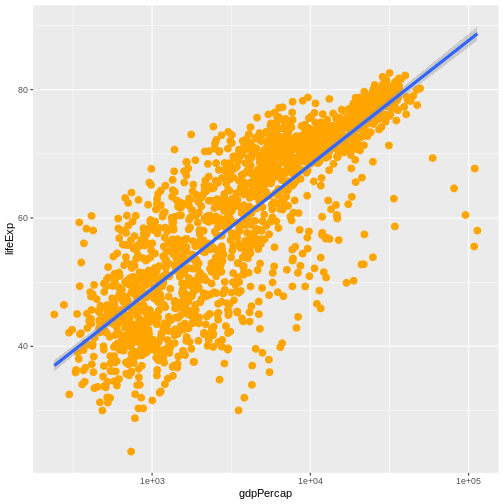
Challenge 4b
Modify your solution to Challenge 4a so that the points are now a different shape and are colored by continent with new trendlines. Hint: The color argument can be used inside the aesthetic.
Here is a possible solution: Notice that supplying the
color argument inside the aes() functions
enables you to connect it to a certain variable. The shape
argument, as you can see, modifies all data points the same way (it is
outside the aes() call) while the color
argument which is placed inside the aes() call modifies a
point’s color based on its continent value.
R
ggplot(data = gapminder, mapping = aes(x = gdpPercap, y = lifeExp, color = continent)) +
 geom_point(size=3, shape=17) + scale_x_log10() +
 geom_smooth(method="lm", size=1.5)
OUTPUT
`geom_smooth()` using formula = 'y ~ x'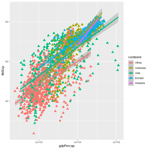
Multi-panel figures
Earlier we visualized the change in life expectancy over time across all countries in one plot. Alternatively, we can split this out over multiple panels by adding a layer of facet panels.
Tip
We start by making a subset of data including only countries located in the Americas. This includes 25 countries, which will begin to clutter the figure. Note that we apply a “theme” definition to rotate the x-axis labels to maintain readability. Nearly everything in ggplot2 is customizable.
R
americas <- gapminder[gapminder$continent == "Americas",]
ggplot(data = americas, mapping = aes(x = year, y = lifeExp)) +
  geom_line() +
  facet_wrap( ~ country) +
  theme(axis.text.x = element_text(angle = 45))
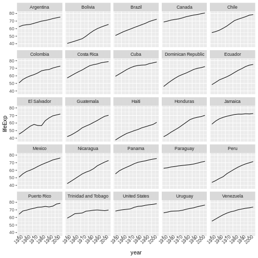
The facet_wrap layer took a “formula” as its argument,
denoted by the tilde (~). This tells R to draw a panel for each unique
value in the country column of the gapminder dataset.
Modifying text
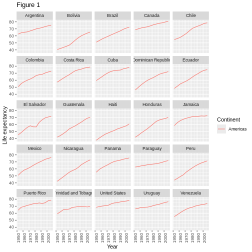
To clean this figure up for a publication we need to change some of the text elements. The x-axis is too cluttered, and the y axis should read “Life expectancy”, rather than the column name in the data frame.
We can do this by adding a couple of different layers. The
theme layer controls the axis text, and overall text
size. Labels for the axes, plot title and any legend can be set using
the labs function. Legend titles are set using the same
names we used in the aes specification. Thus below the
color legend title is set using color = "Continent", while
the title of a fill legend would be set using
fill = "MyTitle".
R
ggplot(data = americas, mapping = aes(x = year, y = lifeExp, color=continent)) +
  geom_line() + facet_wrap( ~ country) +
  labs(
    x = "Year",              # x axis title
    y = "Life expectancy",   # y axis title
    title = "Figure 1",      # main title of figure
    color = "Continent"      # title of legend
  ) +
  theme(axis.text.x = element_text(angle = 90, hjust = 1))
Exporting the plot
The ggsave() function allows you to export a plot
created with ggplot. You can specify the dimension and resolution of
your plot by adjusting the appropriate arguments (width,
height and dpi) to create high quality
graphics for publication. In order to save the plot from above, we first
assign it to a variable lifeExp_plot, then tell
ggsave to save that plot in png format to a
directory called results. (Make sure you have a
results/ folder in your working directory.)
R
lifeExp_plot <- ggplot(data = americas, mapping = aes(x = year, y = lifeExp, color=continent)) +
  geom_line() + facet_wrap( ~ country) +
  labs(
    x = "Year",              # x axis title
    y = "Life expectancy",   # y axis title
    title = "Figure 1",      # main title of figure
    color = "Continent"      # title of legend
  ) +
  theme(axis.text.x = element_text(angle = 90, hjust = 1))

ggsave(filename = "results/lifeExp.png", plot = lifeExp_plot, width = 12, height = 10, dpi = 300, units = "cm")
There are two nice things about ggsave. First, it
defaults to the last plot, so if you omit the plot argument
it will automatically save the last plot you created with
ggplot. Secondly, it tries to determine the format you want
to save your plot in from the file extension you provide for the
filename (for example .png or .pdf). If you
need to, you can specify the format explicitly in the
device argument.
This is a taste of what you can do with ggplot2. RStudio provides a really useful cheat sheet of the different layers available, and more extensive documentation is available on the ggplot2 website. All RStudio cheat sheets can be found on this site. Finally, if you have no idea how to change something, a quick Google search will usually send you to a relevant question and answer on Stack Overflow with reusable code to modify!
Challenge 5
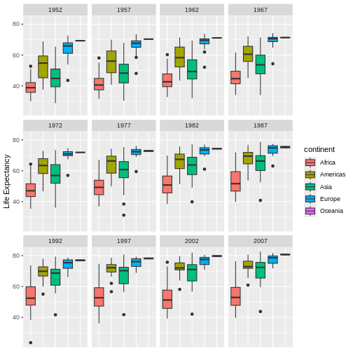
Generate boxplots to compare life expectancy between the different continents during the available years.
Advanced:
- Rename y axis as Life Expectancy.
- Remove x axis labels.
Here a possible solution: xlab() and ylab()
set labels for the x and y axes, respectively The axis title, text and
ticks are attributes of the theme and must be modified within a
theme() call.
R
ggplot(data = gapminder, mapping = aes(x = continent, y = lifeExp, fill = continent)) +
 geom_boxplot() + facet_wrap(~year) +
 ylab("Life Expectancy") +
 theme(axis.title.x=element_blank(),
       axis.text.x = element_blank(),
       axis.ticks.x = element_blank())
Key Points
- Use
ggplot2to create plots. - Think about graphics in layers: aesthetics, geometry, statistics, scale transformation, and grouping.
